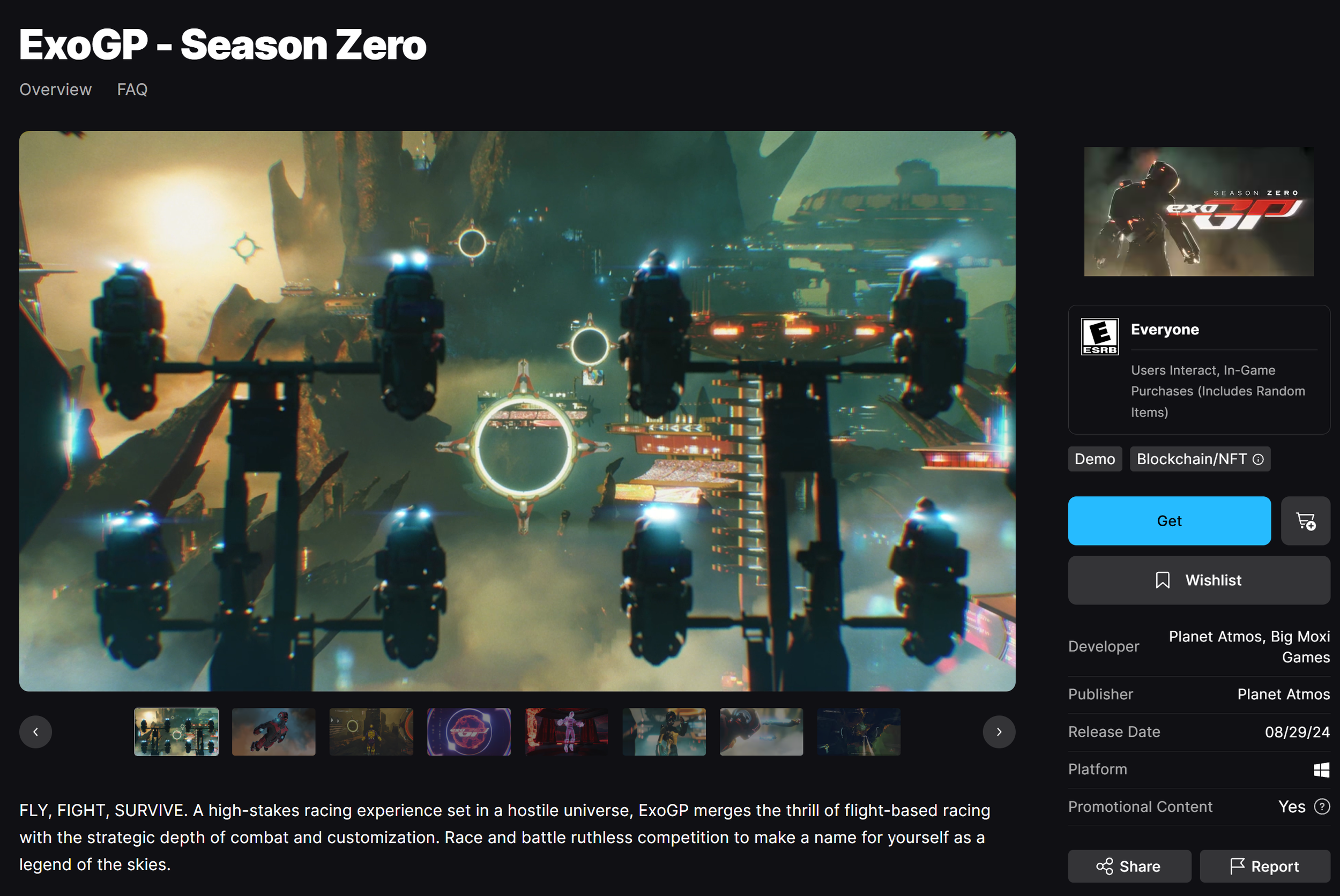
EXOGP, SCI-FI RACING platform
ExoGP is a AAA Web3 sci-fi racing game where I led UX design for player-facing systems like custom game screens, main menus, options/accessibility, and track-driven moments. I also helmed the COTA track build in Unreal Engine, designing modular level pieces and flows in close collaboration with a 40+ person team. ExoGP was released on Epic Games Store.
DESIGN CHALLENGE
We were contracted by Atmos Labs, a Web 3.0 development studio to develop primarily the entire user experience of their upincoming racing platform: ExoGP. This was one of three major products I was simultaneously working on during my time at Pocket Pinata Interactive.
There were two areas of UX design where my asssitance was needed. One being, the entirety of the high level concepts for the navigable interfaces within ExoGP. From landing page navigation to being able to accessibility options, I was tasked with covering the majority of these connections. Next and more challenging, was the integration flow of Web 3.0, cryptocurrency wallet connections in the game.
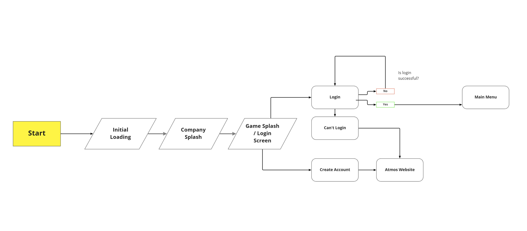
SIGN-IN AND ONBOARDING
For the Main Menu, it was important to display my concepts and user flows in high level concept nodes to clarify systems for the team. Though this flow wasn’t particularily complex, it was vital to have all the wallet integration and sign-in elements abundantly clear for the user to understand. ExoGP has a market component where real world money was attached as NFT economies were growing at the time of development of this product.
A key bridge we needed to create was if the user did not already have an account, it would force them to the Atmos Labs website to make one.
UX FLOWS VISUALIZED
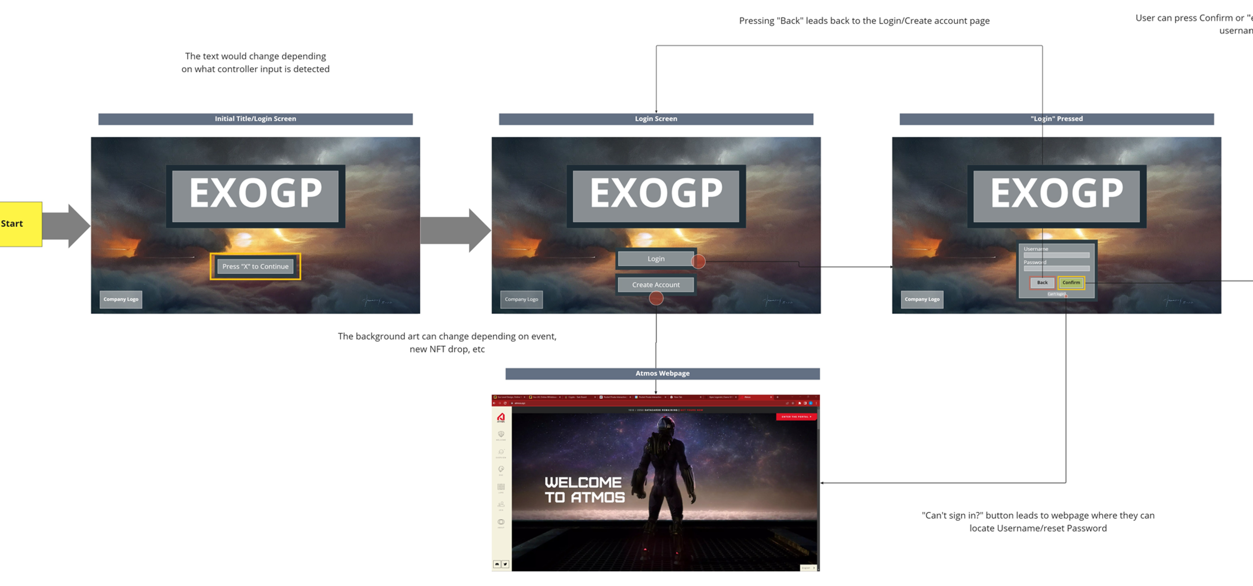
My design sinsibilities here is an example of the organization and clarity I have within my way of thinking. Although visual elements will be present, I use various tools to highlight/encircle specific valuable components that could easily be handed off to a UI Artist or Engineer. The flow initially assumes they have an account to sign into, if they choose to create an account, they will be directed to the company’s web page.
Red circle symbolize where the user presses, and the lines directly lead the eye to the next screen/flow. Adding text along the way of the arrows is important to further develop an understanding of where the user is going and why they are going there.
Interfaces and screens
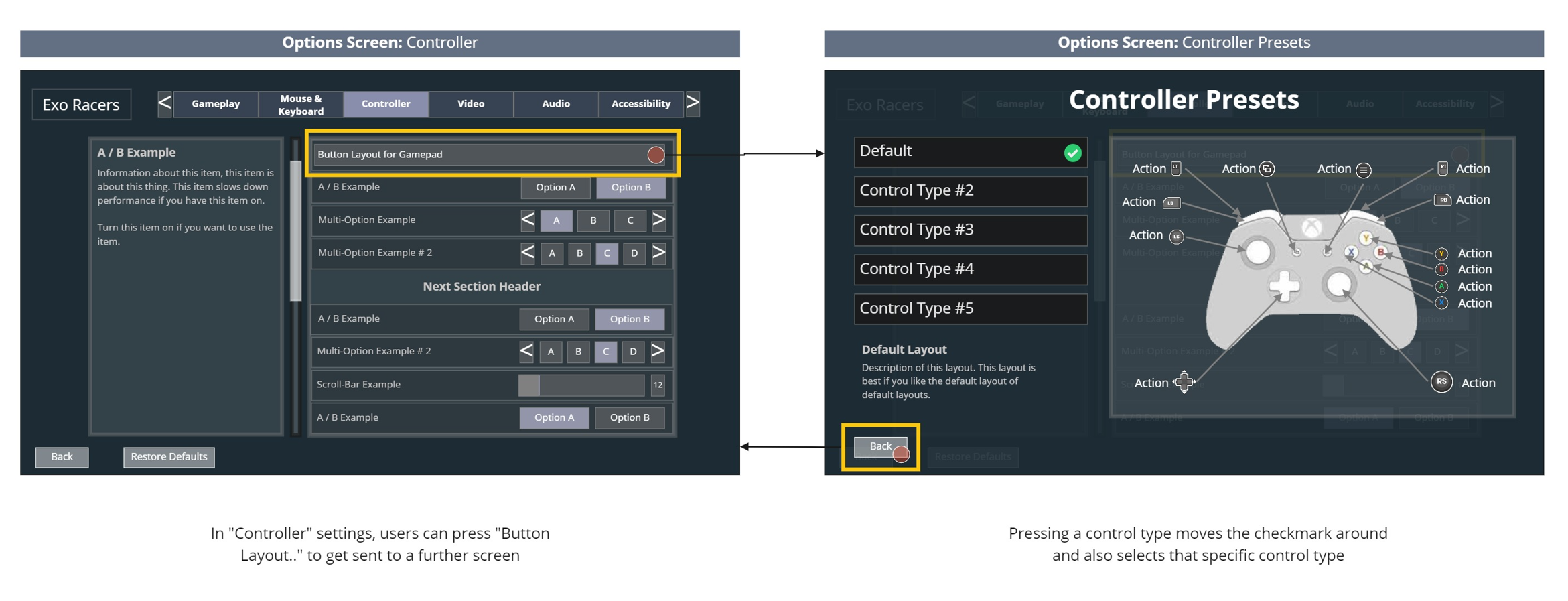
We conducted a ton of research into similar products and games that focus on a sci-fi or racing asthetic for these designs. They needed to be crisp, sleek and align itself with the brand. Some games do not explain what each setting does, and I think it’s important for casual players to understand these options. This is why as you can see under the UI “Options Screen: Controller” on the left we have an information box to provide this info to players.
Modularity in approach
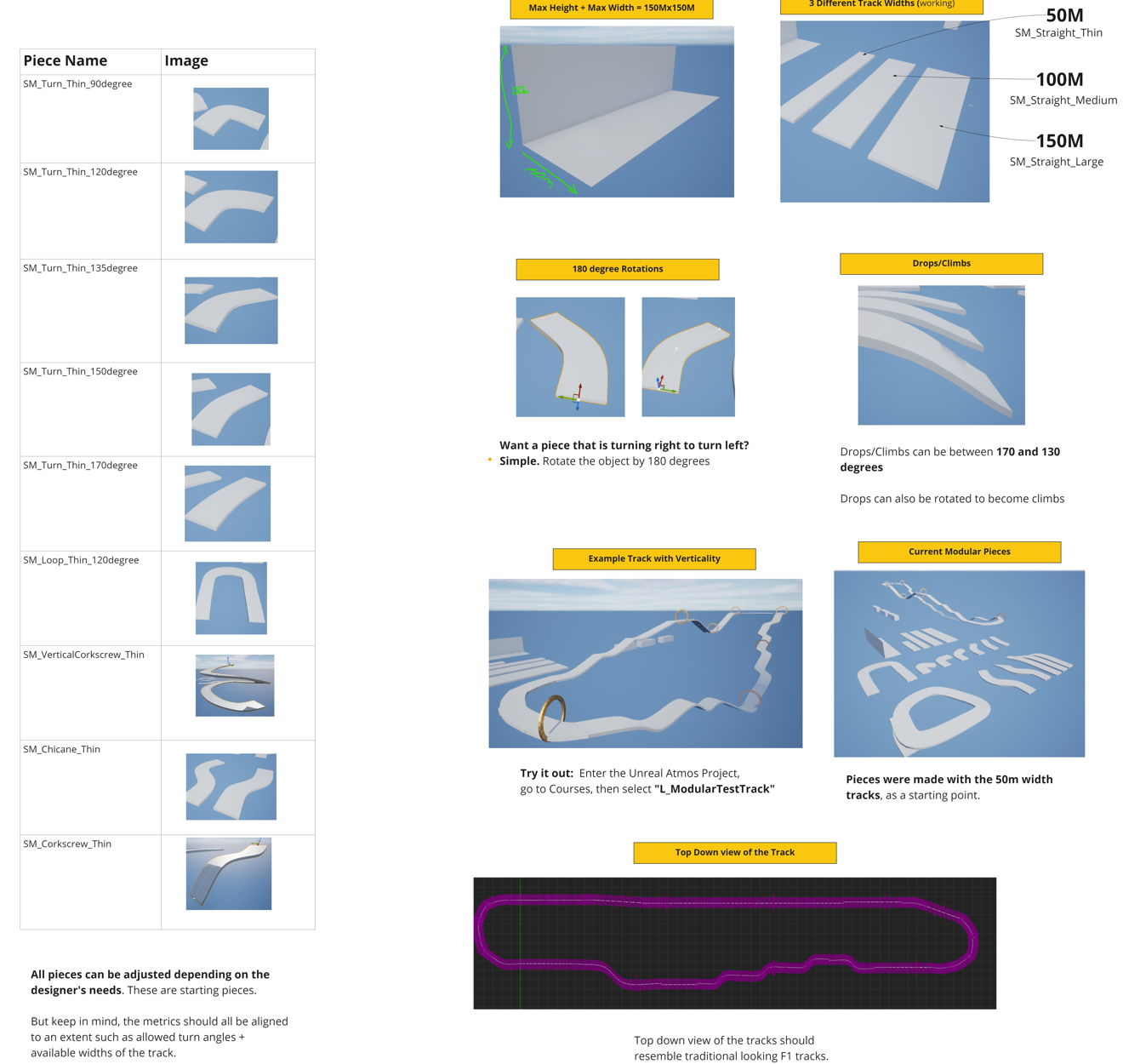
One of my final tasks of the project was to create a model of the COTA (Circuit of The Americas) for a tech demo for further investor consideration for Atmos Labs. I did extensive research into this famous track as well as creating individual track pieces that could be utilized by designers. It was a challenge to add verticality to the game as the game of course didn’t use traditional cars as the playable characters in game - rather they used “iron man” style suits to fly vertically. I had to thoughtfully raise and lower gameplay pieces to provide the sensation of flying within the track.
IMPACT
A majority of my UX/UI concepts are in the current build of ExoGP on the Epic Games store. Although not every design I built translated into a direct appearance in the game, they still were used as a base canvas for further development and iteration. The sign-in flow specifically almost is directly replicated in the product right now and it has been an extremely fulfilling experience to go through the steps of concept, research, design, testing, iteration and final shipping of my designs and thinking.